
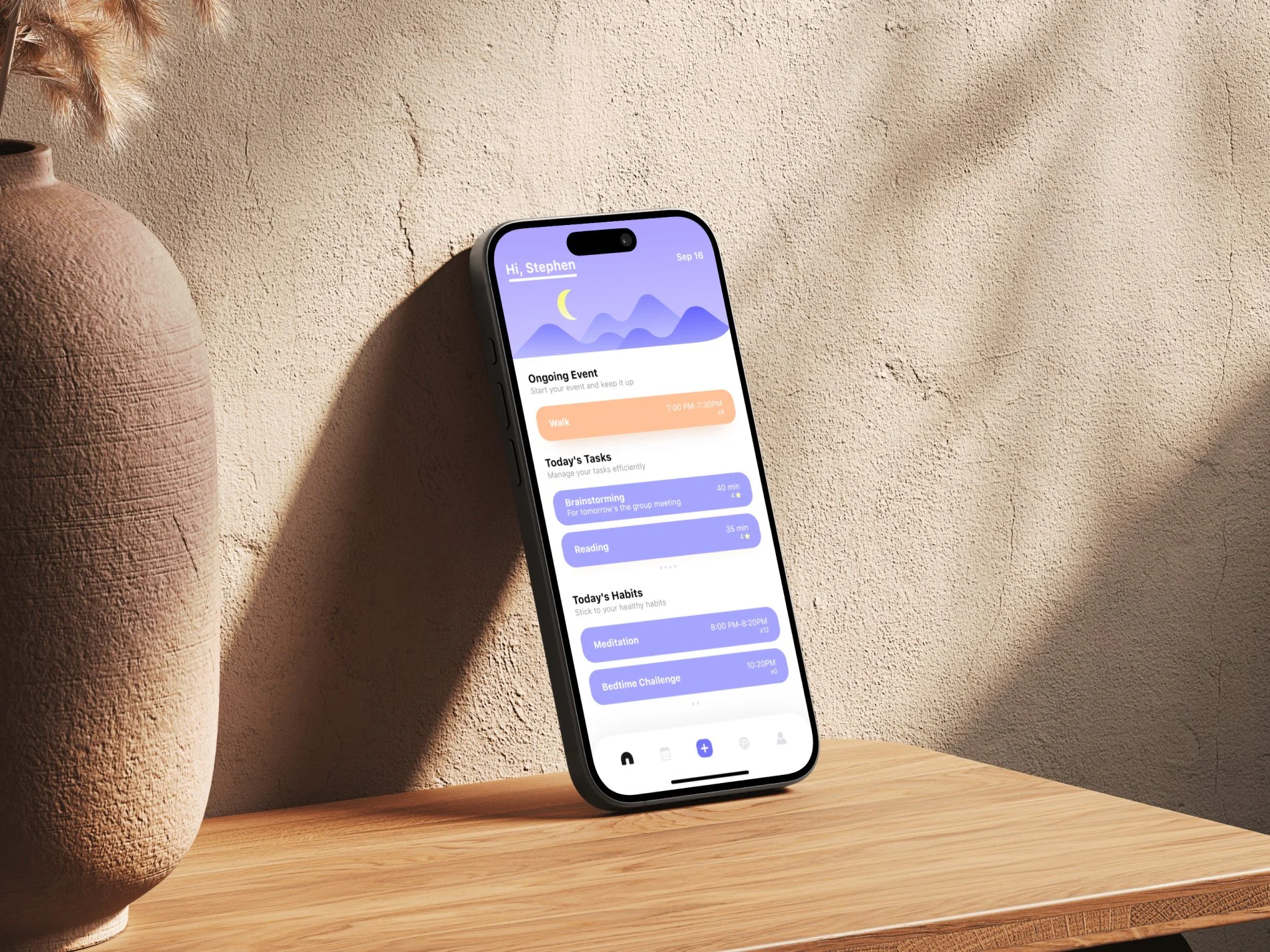
DOIT

A personal mobile planning project exploring how tasks and habits can accommodate a changing day.
BACKGROUND
DOIT focuses on people managing a mix of scheduled tasks, flexible activities, and recurring habits. A call may need a fixed start time. Reading may fit into an available gap. An evening walk may repeat throughout the week. These activities belong to the same day, but they do not need identical scheduling rules.
The design challenge is to support those differences while keeping the next action understandable. People need enough control to express their plans, and a clear way to see what matters when they return to the app.
Planning around different kinds of commitments
The problem behind the concept
but the original timing may no longer fit. A useful planner needs to make it possible to revisit that activity without losing track of fixed commitments or recurring routines.
This scenario frames the project around two questions. How should someone create and adjust an activity without navigating unnecessary settings? Once the activity exists, how should the interface distinguish what is happening now from what comes next?
My role
Product Designer
I independently developed DOIT’s product concept, user flows, and mobile UI over 14 weeks. My work focused on task and habit setup, editing and reuse, daily planning, and focused execution.
OBJECTIVES
What I want to achieve
Make tasks and habits easy to create and adjust, supporting both fixed schedules and flexible routines.
Help users distinguish ongoing activities from upcoming plans and move into focused execution.
Connecting flexible planning with focused action
Planning and execution require different kinds of clarity. When creating an activity, users need control over timing, repetition, and reminders. When returning to their day, they need to see what is happening now and what comes next. DOIT connects these moments through activity setup, a daily overview, and a focused execution view.
APPROACH
Editing a plan with enough control
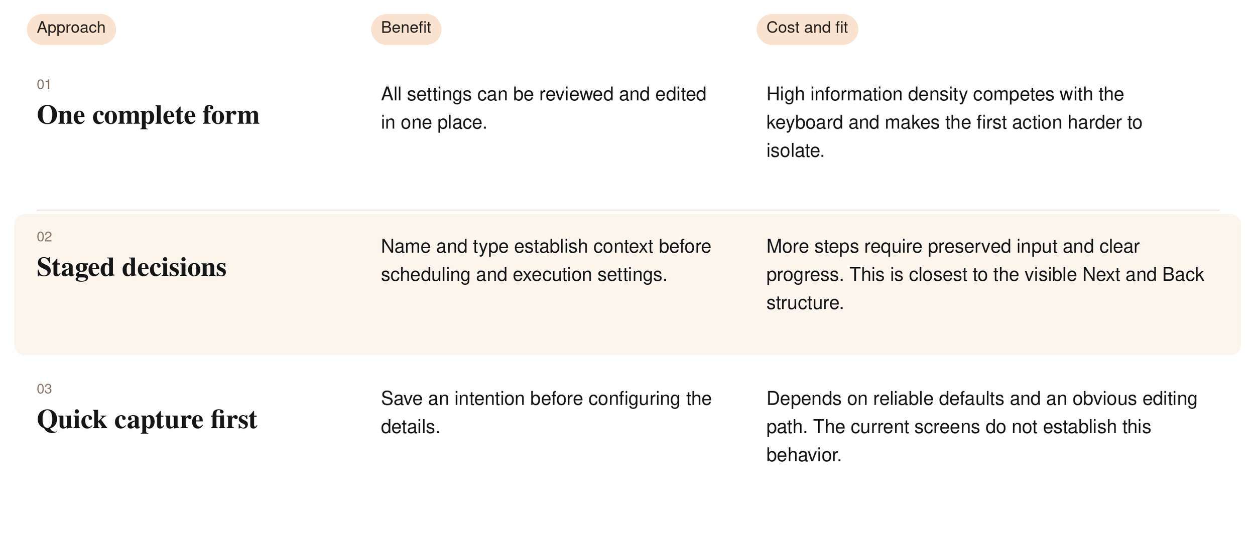
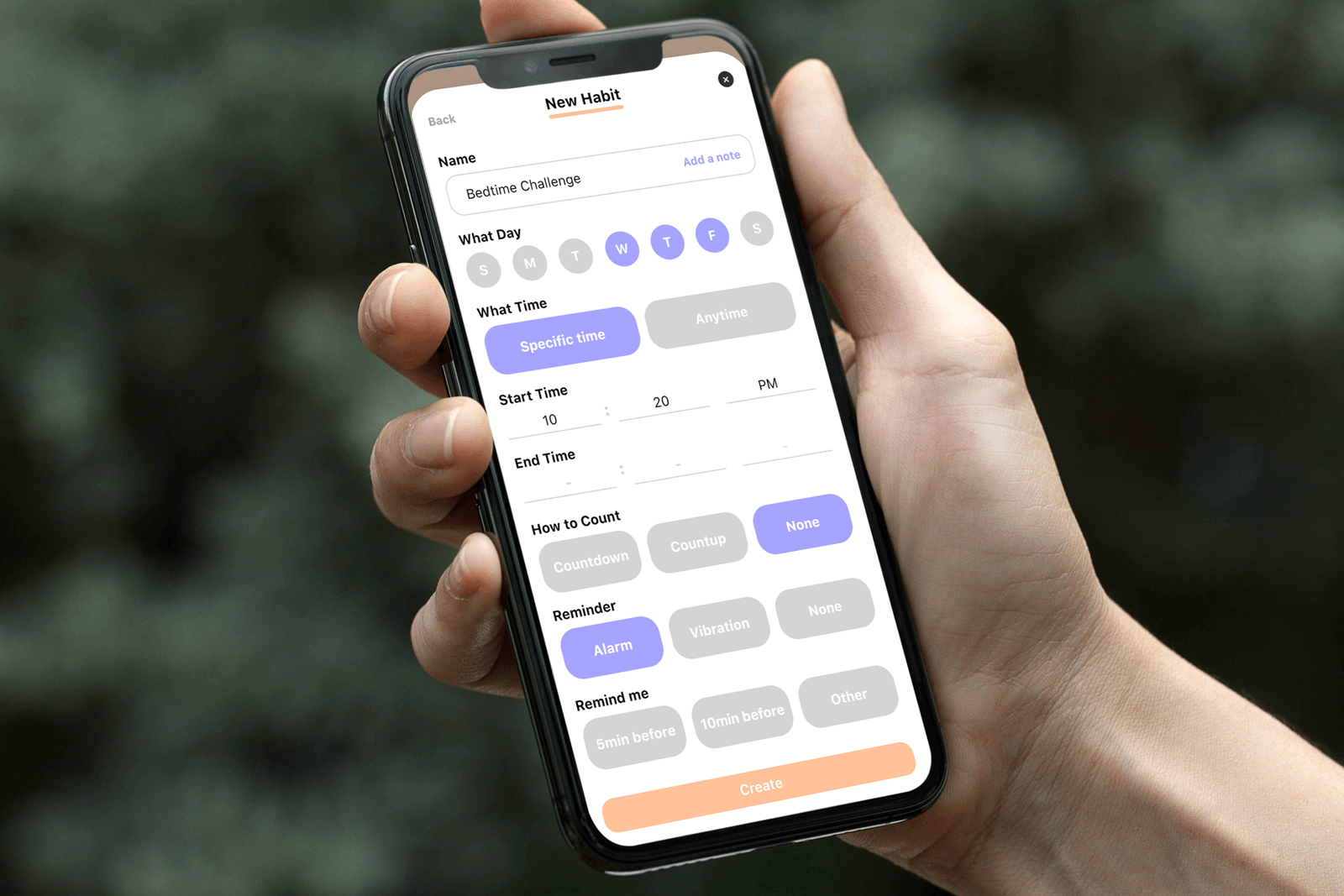
Creating an activity involves decisions about its name, repetition, timing, and optional support such as a timer or reminder. On a phone, presenting all of these choices together makes the form compete with the keyboard and gives every setting similar visual weight.
FINAL DESIGN
Organize decisions around the activity
The key decision was how to balance control with creation effort. A complete form keeps every setting in one place, but also makes someone consider timing, recurrence, and execution preferences together. I used a staged structure so the activity name and type establish context before more detailed settings appear.
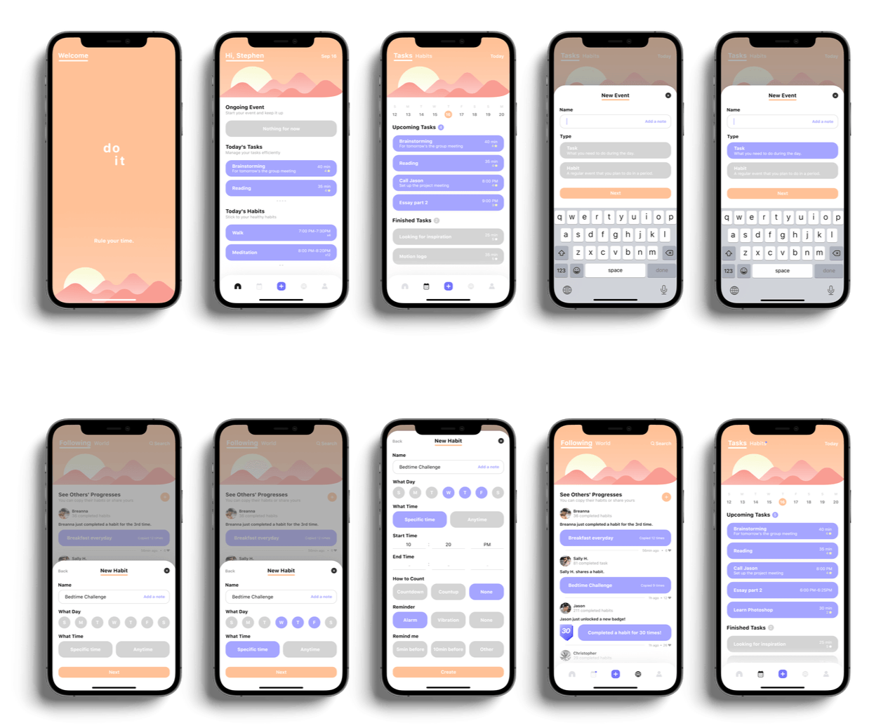
This sequence gives each stage a specific purpose: define the activity, establish its schedule, then configure how it will be tracked or prompted. The tradeoff is more navigation. I prioritized grouping related decisions over minimizing the number of screens.
Establish the activity before configuring its behavior
New Event begins with the activity name and the Task or Habit choice. Habit setup then introduces weekdays and the choice between Specific time and Anytime. Counting and reminder controls appear in the detailed configuration. This separates deciding what to do from deciding how it fits into the day.
Make progress the focus during execution
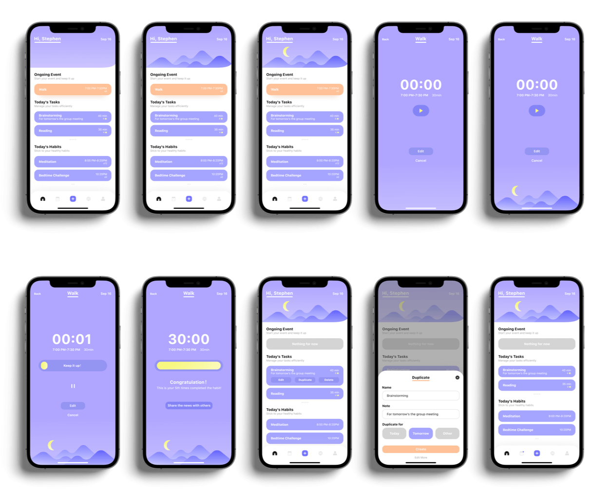
I centered the activity name, timer, and primary control so the screen focuses on the activity already selected. The play control introduces the start state, pause is available during execution, and a completion message marks the finished state. Edit and Cancel remain secondary so they do not compete with the main action.
Make reuse an explicit action
Repeating a familiar task should not require entering its name and note again. I placed Duplicate alongside Edit and Delete on the task card. The duplicate sheet keeps those details available and offers Today, Tomorrow, or Other for the new item. Keeping Duplicate separate from Edit makes reuse an intentional action rather than an ambiguous change to the original.
Demo & story
Promo video
CONCLUSION & TAKEAWAYS
Project outcome
DOIT brings task and habit creation, a daily overview, focused execution, and community participation into a connected mobile concept. The screens demonstrate how different scheduling choices can sit within one product, and how an activity can move from planning to execution and completion.
The next question is whether these choices make everyday adjustments easier to understand and carry out. That requires evidence from the creation, interruption, and completion tasks described above. The visual deliverable alone does not establish reduced stress, improved productivity, or sustained habit formation.
What I learned
Flexibility adds choices, so the design has to explain where each choice belongs. Separating schedule, tracking, and reminders gave the creation flow clearer responsibilities. Separating overview and execution gave the display experience clearer priorities.
The central tradeoff is between immediate access and focused decisions. Additional steps and screens create navigation costs, but they also let each moment serve a more specific purpose. My main takeaway is to give each step enough context to justify the transition.